
File:Bitcoin electricity consumption.svg

Size of this PNG preview of this SVG file: 771 × 600 pixels. Other resolutions: 309 × 240 pixels | 617 × 480 pixels | 988 × 768 pixels | 1,280 × 996 pixels | 2,560 × 1,991 pixels | 864 × 672 pixels.
Original file (SVG file, nominally 864 × 672 pixels, file size: 448 KB)
| This is a file from the Wikimedia Commons. Information from its description page there is shown below. Commons is a freely licensed media file repository. You can help. |
Summary
| Description |
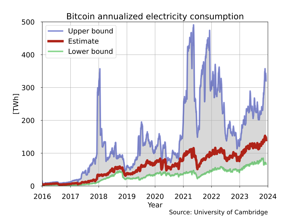
English: Bitcoin electricity consumption based on data from the University of Cambridge (Source: Cambridge Bitcoin Electricity Consumption Index. https://cbeci.org/). This plot is an updated SVG replacement for File:Bitcoin electricity consumption.png. (The country equivalents in the old plot have been left out as requested at Commons:Graphic_Lab/Illustration_workshop#Bitcoin_annualized_electricity_consumption.) |
||
| Date | |||
| Source |
Own work Data sources: |
||
| Author | Morn | ||
| SVG development | This plot was created with Matplotlib. | ||
| Source code | Python code
|
| This file may be updated to reflect new information. If you wish to use a specific version of the file without it being overwritten, please upload the required version as a separate file. |
Licensing
I, the copyright holder of this work, hereby publish it under the following license:
| This file is made available under the Creative Commons CC0 1.0 Universal Public Domain Dedication. | |
| The person who associated a work with this deed has dedicated the work to the public domain by waiving all of their rights to the work worldwide under copyright law, including all related and neighboring rights, to the extent allowed by law. You can copy, modify, distribute and perform the work, even for commercial purposes, all without asking permission.
|
File history
Click on a date/time to view the file as it appeared at that time.
| Date/Time | Thumbnail | Dimensions | User | Comment | |
|---|---|---|---|---|---|
| current | 22:03, 22 February 2025 | | 864 × 672 (448 KB) | wikimediacommons>MTheiler | update 2025-02-22 |
File usage
The following 2 pages use this file: